Variating img aspect ratio
Usage
<!DOCTYPE html>
<html lang="en">
<head>
<meta charset="UTF-8">
<meta http-equiv="X-UA-Compatible" content="IE=edge">
<meta name="viewport" content="width=device-width, initial-scale=1.0">
<title>Variating Gallery</title>
<link rel="stylesheet" href="style.css">
<script src="fit_images.js"></script>
</head>
<body>
<h2>Variating img aspect ratio</h2>
<div class="mixed_gallery">
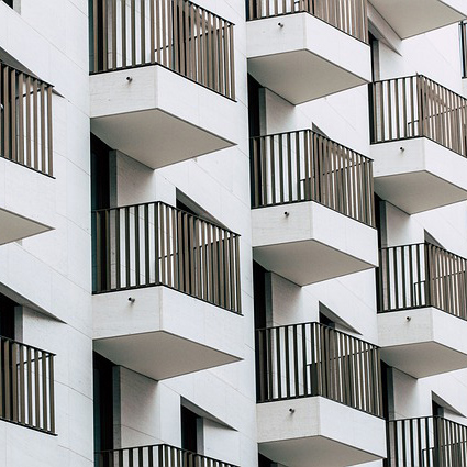
<img src="img/house.jpg" alt="house">
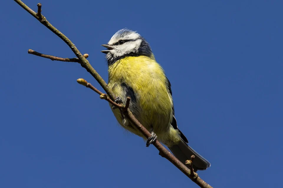
<img src="img/bird.jpg" alt="bird">
<img src="img/wind.jpg" alt="wind">
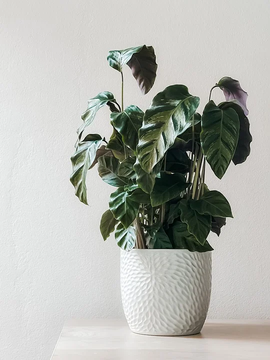
<img src="img/houseplant.jpg" alt="houseplant">
<img src="img/mountain.jpg" alt="mountain">
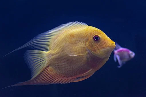
<img src="img/fish.jpg" alt="fish">
<img src="img/facepalm.jpg" alt="facepalm">
</div>
<script>
fit_images()
</script>
</body>
</html>
/* CSS: Variating img aspect ratio */
.mixed_gallery {
padding-top: 1em;
display: flex;
flex-wrap: wrap;
gap: 15px;
}
/* Fill last row empty space */
.mixed_gallery::after {
content: '';
flex-grow: 999999999;
}
/* mobile view*/
@media only screen and (max-width: 500px) {
.mixed_gallery::after{
display: none;
}
}
// fit_images.js
function fit_images(){
const img_elements = document.querySelectorAll('.mixed_gallery img');
for(let x = 0; x < (img_elements.length); x++){
let img = new Image();
let img_elem = img_elements[x]
img.src = img_elem.getAttribute('src');
img.onload = function () {
img_elements[x].setAttribute('style',
`width:${this.width*200/this.height}px;
flex-grow:${this.width*200/this.height}`)
};
}
}